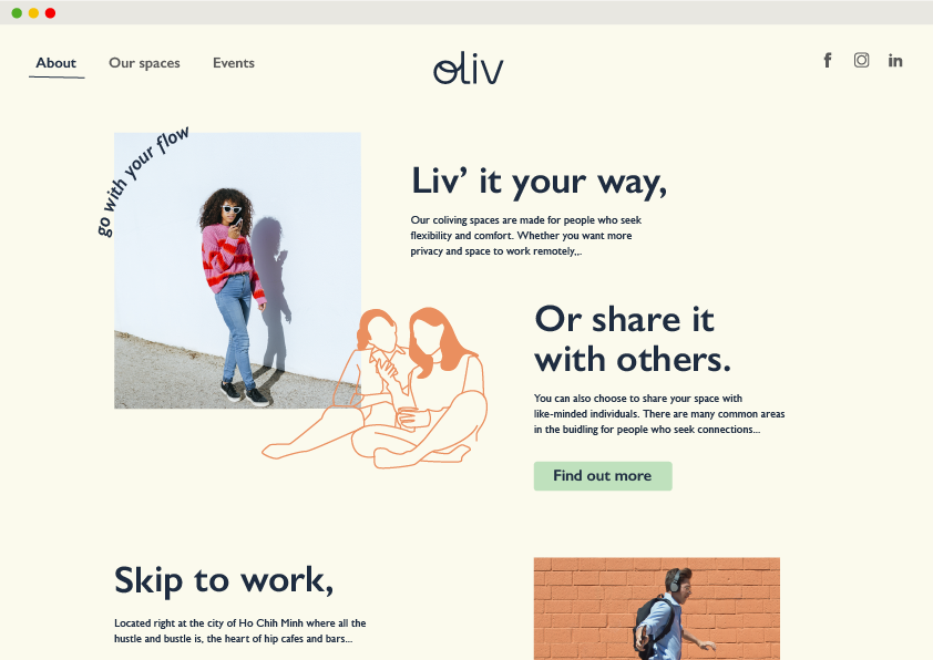
A Co-living Space That Feels Like Home
The client, Empire Group, came to us with a brief to start a co-living space in the heart of Ho Chih Minh city that attracts digital nomads, international students and flexi travellers around the world.
The Strategy
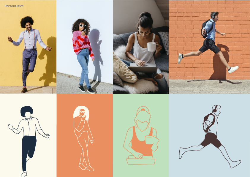
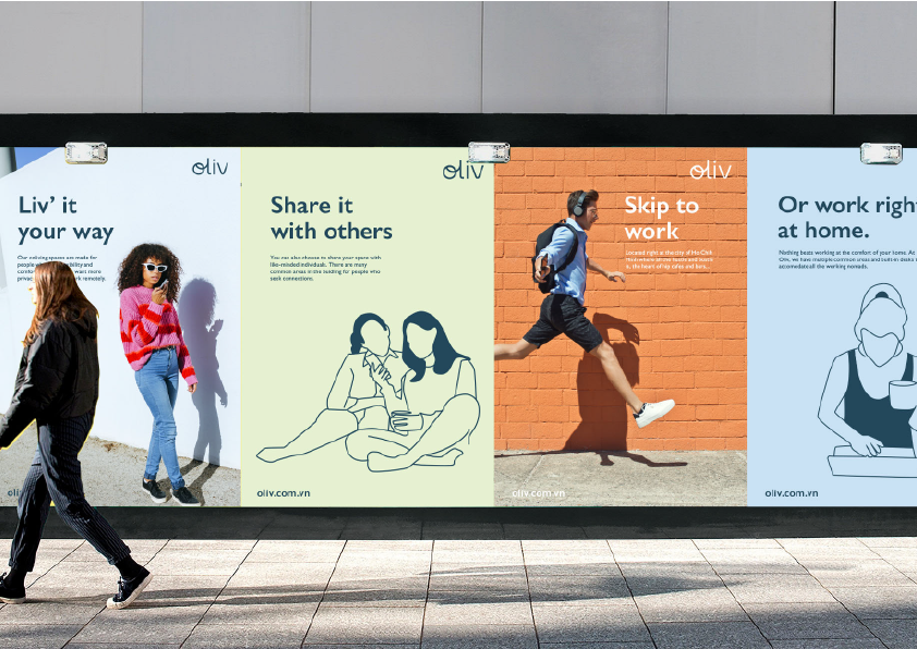
Inspired by many influencers in Bali, setting up their ‘offices’ in vacation spots, the idea of work and play is already growing in most cities in South East Asia. To have the tenants staying longer and treating the space like their ‘home away from home’, the place needs to be injected with their vibrant personalities.
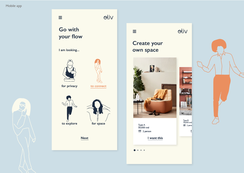
Hence, the name ‘Oliv’ was chosen. It’s a call to live however you want. Aspiring to be more than just a b&b, the tenants will choose their living quarters designed based on their needs and their personalities; whether they need a quiet space to work, or a space for their families, or whether the decor is minimalistic or bohemian.
The Solution
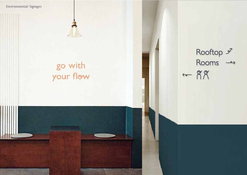
1. Go with your Flow
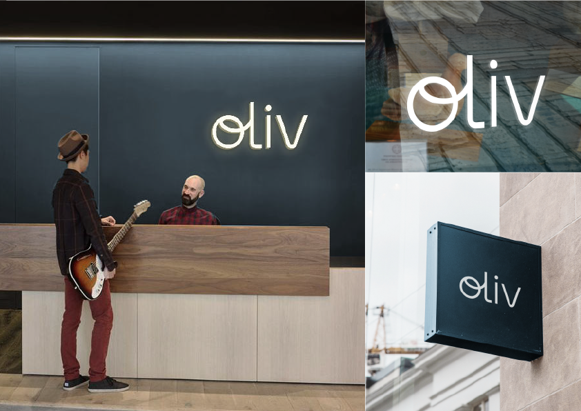
To represent the ‘flow’ in the logo, the ‘o’ in oliv was drawn and connected to ‘l’. 2. Human Illustrations
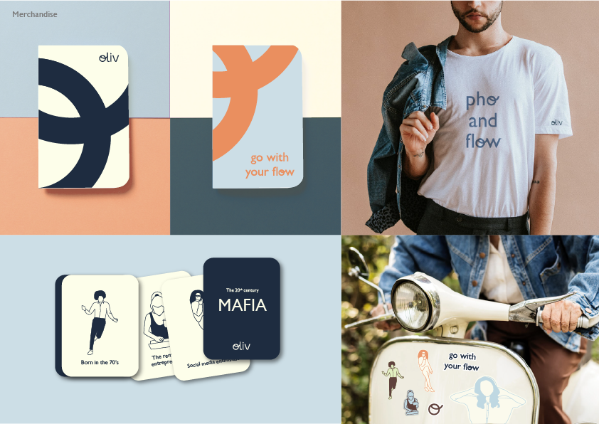
To complement the logo, illustrations were used to represent the different personalities of the audiences. 3. Warm and cosy colours
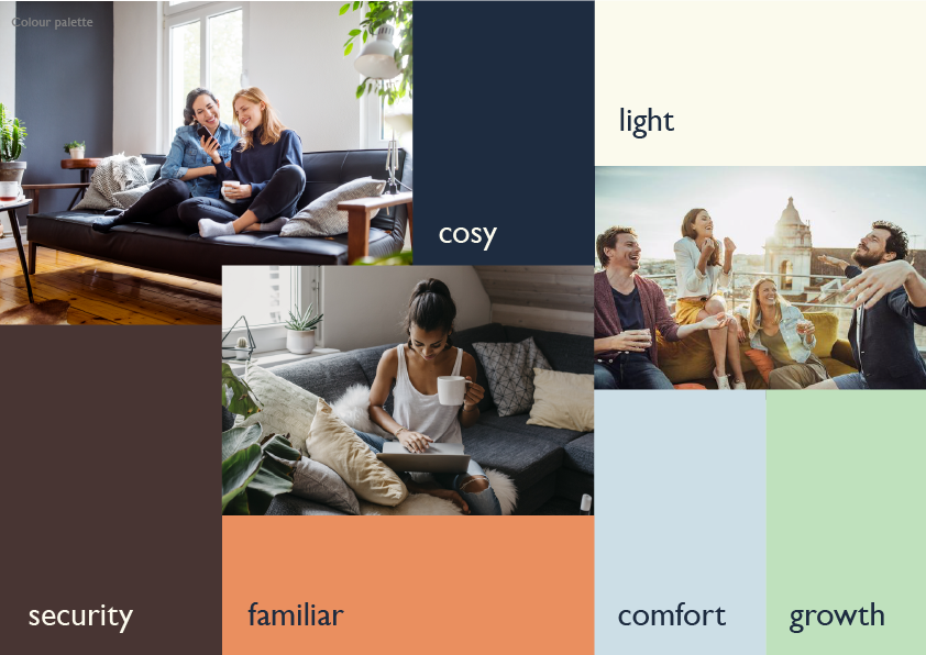
A set of ‘homey’ colours were chosen to reflect the vibes of the co-living space.
Client: Empire Group
Company: Sedgwick Richardson
Art Direction and Design: Yvonne Chew
Company: Sedgwick Richardson
Art Direction and Design: Yvonne Chew
